Chapter 6 Information Visualization
M. Adil Yalcin and Catherine Plaisant
This chapter will show you how to use visualization to explore data as well as to communicate results so that data can be turned into interpretable, actionable information. There are many ways of presenting statistical information that convey content in a rigorous manner. The goal of this chapter is to present an introductory overview of effective visualization techniques for a range of data types and tasks, and to explore the foundations and challenges of information visualization at different stages of a project.
6.1 Introduction
One of the most famous discoveries in science—that disease was transmitted through germs, rather than through pollution—resulted from insights derived from a visualization of the location of London cholera deaths near a water pump (Snow 1855). Information visualization in the twenty-first century can be used to generate similar insights: detecting financial fraud, understanding the spread of a contagious illness, spotting terrorist activity, or evaluating the economic health of a country. But the challenge is greater: many (\(10^{2}\)–\(10^{7}\)) items may be manipulated and visualized, often extracted or aggregated from yet larger data sets, or generated by algorithms for analytics.
Visualization tools can organize data in a meaningful way that lowers the cognitive and analytical effort required to make sense of the data and make data-driven decisions. Users can scan, recognize, understand, and recall visually structured representations more rapidly than they can process nonstructured representations. The science of visualization draws on multiple fields such as perceptual psychology, statistics, and graphic design to present information, and on advances in rapid processing and dynamic to design user interfaces that permit powerful interactive visual analysis.
Figure 6.1, “Anscombe’s quartet” (Anscombe 1973), provides a classic example of the value of visualization compared to basic descriptive statistical analysis. The left-hand panel includes raw data of four small number-pair data sets (A, B, C, D), which have the same average, median, and standard deviation and have correlation across number pairs. The right-hand panel shows these data sets visualized with each point plotted on perpendicular axes (scatterplots), revealing dramatic differences between the data sets, trends, and outliers visually.
![Adapted from Anscombe`s quartet [@anscombe1973graphs]](ChapterViz/figures/fig9-1-new.png)
Figure 6.1: Adapted from Anscombe`s quartet (Anscombe 1973)
In broad terms, visualizations are used either to present results or for analysis and open-ended exploration. This chapter provides an overview of how modern information visualization, or visual data mining, can be used to in the context of big data.
6.2 Developing effective visualizations
The effectiveness of a visualization depends on both analysis needs and design goals. Sometimes, questions about the data are known in advance; in other cases, the goal may be to explore new data sets, generate insights, and answer questions that are unknown before starting the analysis. The design, development, and evaluation of a visualization is guided by understanding the background and goals of the target audience (see Box Effective visualizations45).
The development of an effective visualization is a continuous process that generally includes the following activities:
Specify user needs, tasks, accessibility requirements and criteria for success.
Prepare data (clean, transform).
Design visual representations.
Design interaction.
Plan sharing of insights, provenance.
Prototype/evaluate, including usability testing.
Deploy (monitor usage, provide user support, manage revision process).
If the goal is to present results, there is a wide spectrum of users and a wide range of options. If the audience is broad, then infographics can be developed by graphic designers, as described in classic texts (see Few (2009); Tufte (2001); Tufte (2006) or the examples compiled by Harrison, Reinecke, and Chang (2015); Keshif (n.d.)). If, on the other hand, the audience comprises domain experts interested in monitoring the overview status of dynamic processes on a continuous basis, monitoring dashboards with no or little interactivity can be used. Examples include the monitoring of sales, or the number of tweets about people, or symptoms of the flu and how they compare to a baseline (Few 2013). Such dashboards, composed of multiple charts of different operational data, can increase situational awareness so that problems can be noticed and solved early and better decisions can be made with up-to-date information.
Another goal of visualization is to enable interactive exploratory analysis. This approach goes beyond a visual snapshot of data for presentation, and provides many windows into different parts and relationships within data on demand. Tailor-made solutions can focus on specific querying and navigation tasks given a specific data. For example, the BabyNameVoyager (http://www.babynamewizard.com/voyager/) lets users type in a name and see a graph of its popularity over the past century. With each letter typed, the page filters baby names starting with the input (such as Joan, Joyce and John for input “Jo”).”
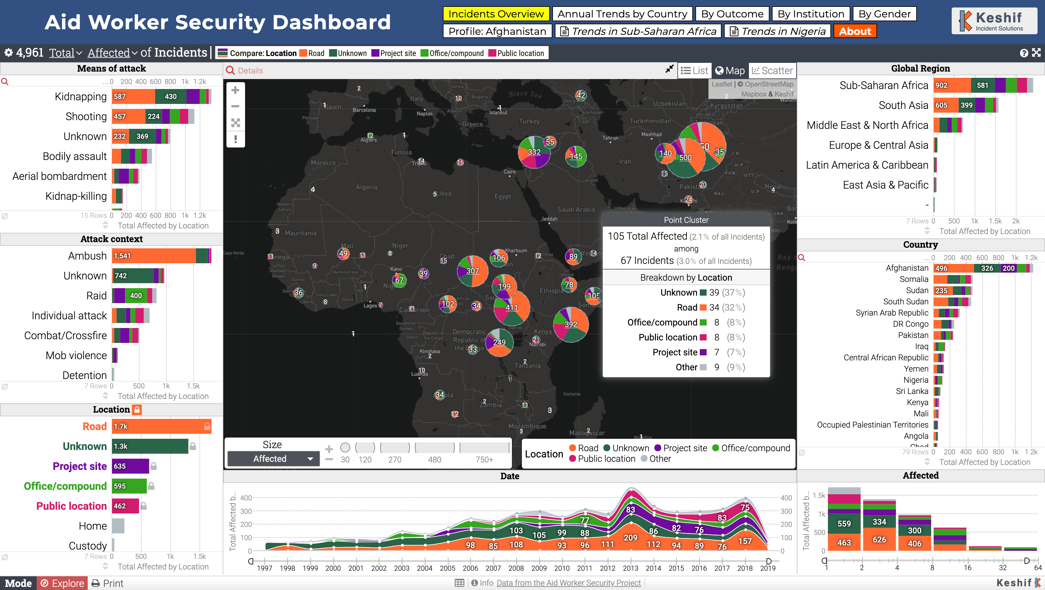
Figure 6.2: Aid Worker Security Incidents Analysis Dashboard (https://gallery.keshif.me/AidWorkerSecurity)
In addition, detailed aspects of a dataset can be made explorable by advanced data querying, navigation and view options. Figure 6.2 shows an interactive dashboard that visualizes the data from the Humanitarian Outcomes’ Aid Worker Security Database (https://aidworkersecurity.org/). In this example, the event point locations are clustered on a map, and surrounding charts show trends in attack means, context, location types, region, country, as well as event date and the number of affected people. This view also presents a breakdown of data by location type, shown using color, includes contextual tooltips that provide details on a geographic cluster of points. Additional shortcuts on top allow navigation to key alternative insights as a storytelling tool.
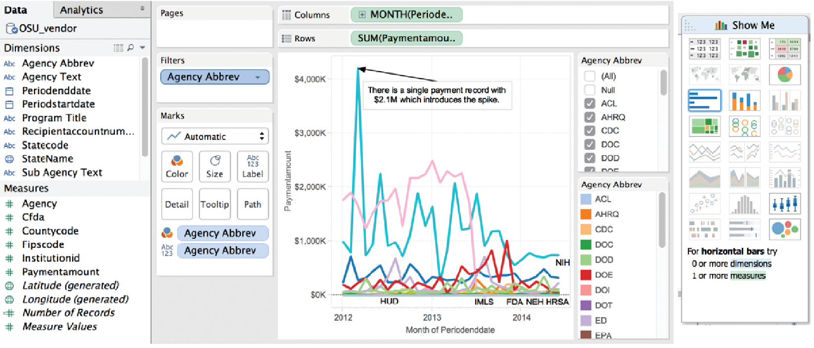
Figure 6.3: Charting interface of Tableau
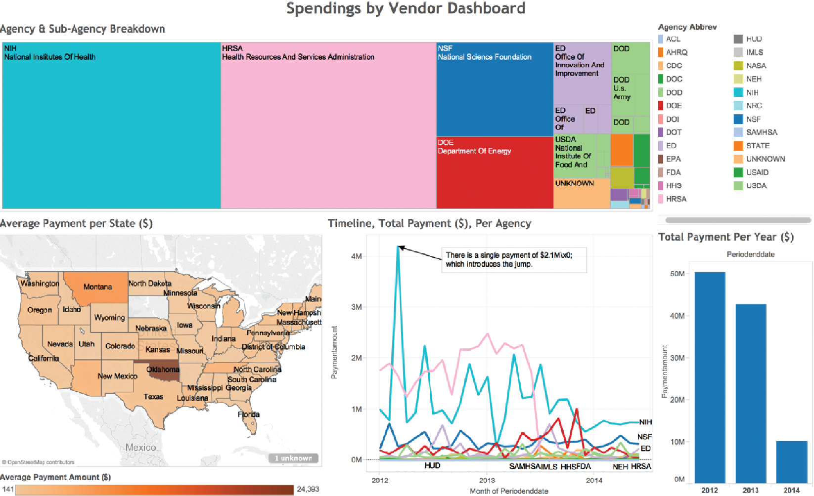
Figure 6.4: A treemap visualization of agency and sub-agency spending breakdown
To create interactive charts and dashboards from new datasets for analysis, products and tools, such as Tableau, PowerBI, Keshif, and others (see Section Resources), offer a range of chart types with various parameters, as well as visual design environments that allow combining and sharing these charts in potent dashboards. For example, Figure 6.3 shows the charting interface of Tableau on a transaction data set. The left-hand panel shows the list of attributes associated with vendor transactions for a given university. The visualization (center) is constructed by placing the month of spending in chart columns, and the sum of payment amount on the chart row, with data encoded using line mark type. Agencies are broken down by color mapping. The agency list, to the right, allows filtering the agencies, which can be used to simplify the chart view. A peak in the line chart is annotated with an explanation of the spike. On the rightmost side, the Show Me panel suggests the applicable chart types potentially appropriate for the selected attributes. This chart can be combined with other charts focusing on other aspects in interactive dashboards. Figure 6.4 shows a treemap (Johnson and Shneiderman 1991) for agency and sub-agency spending breakdown, combined with a map showing average spending per state. Oklahoma state stands out with few but large expenditures. Mousing-over Oklahoma reveals details of these expenditures. An additional histogram provides an overview of spending change across three years.
Creating effective visualizations requires careful consideration of many components. Data values may be encoded using one or more visual elements, like position, length, color, angle, area, and texture (Figure 6.5; see also Cleveland and McGill (1984); Tufte (2001)). Each of these can be organized in a multitude of ways, discussed in more detail by Munzner (2014). In addition to visual data encoding, units for axes, labels, and legends need to be provided as well as explanations of the mappings when the design is unconventional. A visually compelling example is “how to read this data” section of “A world of Terror” project by Periscopic (https://terror.periscopic.com/).
Annotations or comments can be used to guide viewer attention and to describe related insights. Providing attribution and data source, where applicable, is an ethical practice that also enables validating data, and promotes reuse to explore new perspectives.
![Visual elements described by MacKinlay [@mackinlay1986automating]](ChapterViz/figures/fig9-4.png)
Figure 6.5: Visual elements described by MacKinlay (MacKinlay 1986)
The following is a short list of guidelines: provide immediate feedback upon interaction with the visualization; generate tightly coupled views (i.e., so that selection in one view updates the others); and use a high “data to ink ratio” (Tufte 2001). Use color carefully and ensure that the visualization is truthful (e.g., watch for perceptual biases or distortion). Avoid use of three-dimensional representations or embellishments, since comparing 3D volumes is perceptually challenging and occlusion is a problem. Labels and legends should be meaningful, novel layouts should be carefully explained, and online visualizations should adapt to different screen sizes. For extended and in-depth discussions, see various textbooks (Few 2009; Kirk 2012; Ward, Grinstein, and Keim 2010; Munzner 2014; Tufte 2001; Tufte 2006).
We provide a summary of the basic tasks that users typically perform during visual analysis of data in the next section.
6.3 A data-by-tasks taxonomy
We give an overview of visualization approaches for six common data types: multivariate, spatial, temporal, hierarchical, network, and text (Shneiderman and Plaisant 2015). For each data type listed in this section, we discuss its distinctive properties, the common analytical questions, and examples. Real-life data sets often include multiple data types coming from multiple sources. Even a single data source can include a variety of data types. For example, a single data table of countries (as rows) can have a list of attributes with varying types: the growth rate in the last 10 years (one observation per year, time series data), their current population (single numerical data), the amount of trade with other countries (networked/linked data), and the top 10 exported products (if grouped by industry, hierarchical data).
In addition to common data types, Box Tasks provides an overview of common tasks for visual data analysis, which can be applied across different data types based on goals and types of visualizations.
Box: A task categorization for visual data analysis
Select/Query
- Filter to focus on a subset of the data
- Retrieve details of item
- Brush linked selections across multiple charts
- Compare across multiple selections
Navigate
- Scroll along a dimension (1D)
- Pan along two dimensions (2D)
- Zoom along the third dimension (3D)
Derive
- Aggregate item groups and generate characteristics
- Cluster item groups by algorithmic techniques
- Rank items to define ordering
Organize
- Select chart type and data encodings to organize data
- Layout multiple components or panels in the interface
Understand
- Observe distributions
- Compare items and distributions
- Relate items and patterns
Communicate
- Annotate findings
- Share results
- Trace action histories
Interactive visualization design should also consider the devices where data will be viewed and interacted. Conventionally, visualizations have been designed for mouse and keyboard interaction on desktop computers. However, a wider range of device forms, such as mobile devices with small displays and touch interaction, is becoming common. Creating visualizations for new forms requires special care, though basic design principles such as “less is more” still apply.
6.3.1 Multivariate data
In common tabular data, each record (row) has a list of attributes (columns), whose value is mostly categorical or numerical. The analysis of multivariate data with basic categorical and interval types aims to understand patterns within and across data attributes. Given a larger number of attributes, one of the challenges in data exploration and analytics is to select the attributes and relations to focus on. Expertise in the data domain can be helpful for targeting relevant attributes.
Multivariate data can be presented in multiple forms of charts depending on the data and relations being explored. One-dimensional (1D) charts present data on a single axis only. An example is a box-plot, which shows quartile ranges for numerical data. So-called 1.5D charts list the range of possible values on one axis, and describe a measurement of data on the other. Bar charts are a ubiquitous chart type that can effectively visualize numeric data, for example, a numeric grade per student, or grade average for aggregated student groups by gender. Records can also be grouped over numerical ranges such as sales price, and bars can show the number of items in each grouping, which generates a histogram chart. Two-dimensional charts, such as scatterplots, plot data along two attributes, such as scatterplots. Matrix (grid) charts can also be used to show relations between two attributes. Heatmaps visualize each matrix cell using color to represent its value. Correlation matrices show the relation between attribute pairs.
To show relations of more than two attributes (3D+), one option is to use additional visual encodings in a single chart, for example, by adding point size/shape as a data variable in scatterplots. Another option is to use alternative visual designs that can encode multiple relations within a single chart. For example, a parallel coordinate plot (Inselberg 2009) has multiple parallel axes, each one representing an attribute; each record is shown as connected lines passing through the record’s values on each attribute. Charts can also show part-of-whole relations using appropriate mappings based on subdividing the chart space, such as stacked charts or pie charts.
Finally, another approach to analyzing multidimensional data is to use clustering algorithms to identify similar items. Clusters are typically represented as a tree structure (see Section Hierarchical data). For example, \(k\)-means clustering starts by users specifying how many clusters to create; the algorithm then places every item into the most appropriate cluster. Surprising relationships and interesting outliers may be identified by these techniques on mechanical analysis algorithms. However, such results may require more effort to interpret.
6.3.2 Spatial data
Spatial data convey a physical context, commonly in a 2D space, such as geographical maps or floor plans. Several of the most examples of information visualization include maps, from the 1861 representation of Napoleon’s ill-fated Russian campaign by Minard (popularized by Tufte Tufte (2001) and Kraak Kraak (2014)) to the interactive HomeFinder application that introduced the concept of dynamic queries (Ahlberg, Williamson, and Shneiderman 1992). The tasks include finding adjacent items, regions containing certain items or with specific characteristics, and paths between items—and performing the basic tasks listed in Box Effective visualizations.
The primary form of visualizing spatial data is maps. In choropleth maps, color encoding is used to add represent one data attribute. Cartograms aim to encode the attribute value with the size of regions by distorting the underlying physical space. Tile grid maps reduce each spatial area to a uniform size and shape (e.g., a square) so that the color-coded data are easier to observe and compare, tile grid maps convert each spatial region to a fixed shape, such as a square tile and arrange these tiles to approximate and maintain relative physical positions of the regions (DeBelius 2015; Stanford Visualization Group n.d.). Grid maps also make selection of smaller areas (such as small cities or states) easier. Contour (isopleth) maps connect areas with similar measurements and color each one separately. Network maps aim to show network connectivity between locations, such as flights to/from many regions of the world. Spatial data can be also presented with a nonspatial emphasis (e.g., as a hierarchy of continents, countries, and cities, such as by using a treemap chart.).
![The US Cancer Atlas [@usca]. Interface based on [@maceachren2008design]](ChapterViz/figures/fig9-5.png)
Figure 6.6: The US Cancer Atlas (Centers for Disease Control and Prevention 2014). Interface based on (MacEachren et al. 2008)
Maps are commonly combined with other visualizations. For example, in Figure 6.6, the US Cancer Atlas combines a map showing patterns across states on one attribute, with a sortable table providing additional statistical information and a scatterplot that allows users to explore correlations between attributes. Figures 6.2 and 6.4 also demonstrate the use of different map designs in the context of larger analytical solutions.
6.3.3 Temporal data
Time is the unique dimension in our physical world that steadily flows forward. While we cannot control time, we frequently record it as a point or an interval. Figures 6.2 and 6.3 exemplify line charts that show trends over multiple years, with each single line representing a subset of the data for cross-comparison of temporal trends. Temporal data also has multiple levels of representation (year, month, day, hour, minute, and so on) with irregularities (leap year, different days per month, etc.). As we measure time based on cyclic events in nature (day/night), our representations are also commonly cyclic. For example, January follows December (first month follows last). This cyclic nature can be captured by circular visual encodings, such as the the conventional clock with hour, minute, and second hands.
Time series data (Figures 6.7 and 6.8) describe values measured at regular intervals, such as stock market or weather data. The focus of analysis is to understand temporal trends and anomalies, querying for specific patterns, or prediction. To show multiple time-series trends across different data categories in a very compact chart area, each trend can be shown with small height using a multi-layered color approach, creating horizon graphs. While perceptually effective after learning to read its encoding, this chart design may not be appropriate for audiences who may lack such training or familiarity.
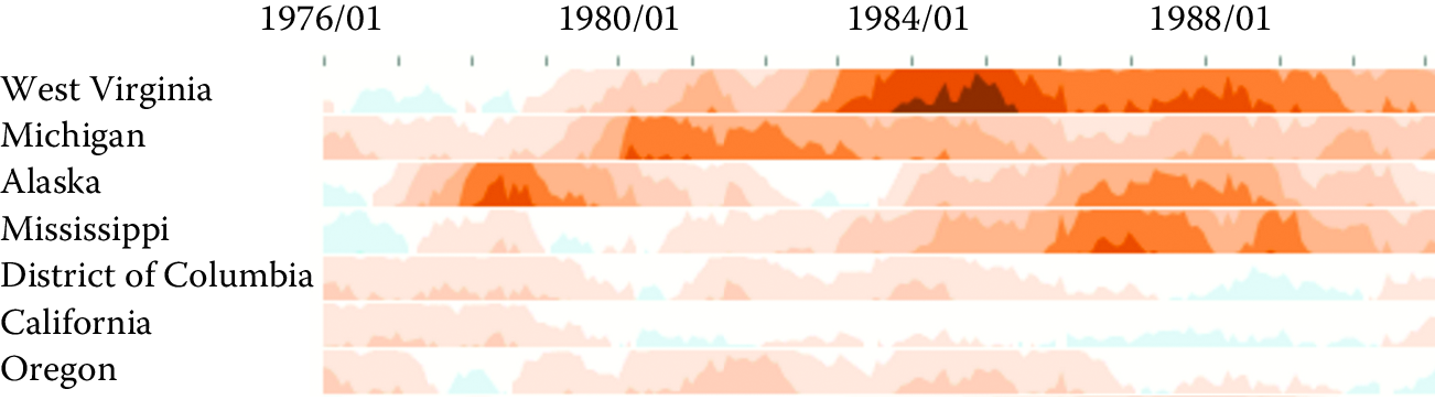
Figure 6.7: Horizon graphs used to display time series
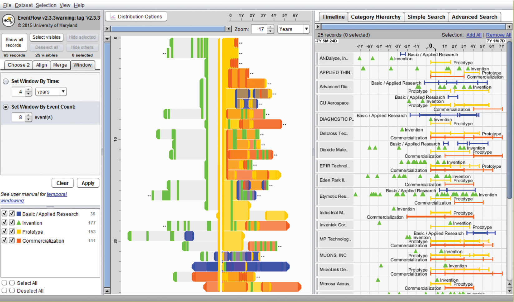
Figure 6.8: EventFlow (https://hcil.umd.edu/eventflow/) is used to visualize sequences of innovation activities by Illinois companies. Created with EventFlow; data sources include NIH, NSF, USPTO, SBIR. Image created by C. Scott Dempwolf, used with permission
Another form of temporal analysis is understanding sequences of events. The study of human activity often includes analyzing event sequences. For example, students’ records include events such as attending orientation, getting a grade in a class, going on internship, and graduation. In the analysis of event sequences, finding the most common patterns, spotting rare ones, searching for specific sequences, or understanding what leads to particular types of events is important (e.g., what events lead to a student dropping out, precede a medical error, or a company filing bankruptcy). Figure 6.8 shows EventFlow used to visualize sequences of innovation activities by Illinois companies. Activity types include research, invention, prototyping, and commercialization. The timeline (right panel) shows the sequence of activities for each company. The overview panel (center) summarizes all the records aligned by the first prototyping activity of the company. In most of the sequences shown here, the company’s first prototype is preceded by two or more patents with a lag of about a year.
6.3.4 Hierarchical data
Data are often organized in a hierarchical fashion. Each item appears in one grouping (e.g., like a file in a folder), and groups can be grouped to form larger groups (e.g., a folder within a folder), up to the root (e.g., a hard disk). Items, and the relations between items and their grouping, can have their own attributes. For example, the National Science Foundation is organized into directorates and divisions, each with a budget and a number of grant recipients.
Analysis may focus on the structure of the relations, by questions such as “how deep is the tree?”, “how many items does this branch have?”, or “what are the characteristics of one branch compared to another?” In such cases, the most appropriate representation is usually a node-link diagram (Plaisant, Grosjean, and Bederson 2002; Card and Nation 2002). In Figure 6.9, Spacetree is used to browse a company organizational chart. Since not all the nodes of the tree fit on the screen, we see an iconic representation of the branches that cannot be displayed, indicating the size of each branch. As the tree branches are opened or closed, the layout is updated with smooth multiple-step animations to help users remain oriented.
When the structure is less important but the attribute values of the leaf nodes are of primary interest, treemaps, a space-filling approach, are preferable as they can show arbitrary-sized trees in a fixed rectangular space and map one attribute to the size of each rectangle and another to color. For example, Figure 6.10 shows the Finviz treemap that helps users monitor the stock market. Each stock is shown as a rectangle. The size of the rectangle represents market capitalization, and color indicates whether the stock is going up or down. Treemaps are effective for situation awareness: we can see that today is a fairly bad day as most stocks are red (i.e., down). Stocks are organized in a hierarchy of industries, allowing users to see that “healthcare technology” is not doing as poorly as most other industries. Users can also zoom on healthcare to focus on that industry.
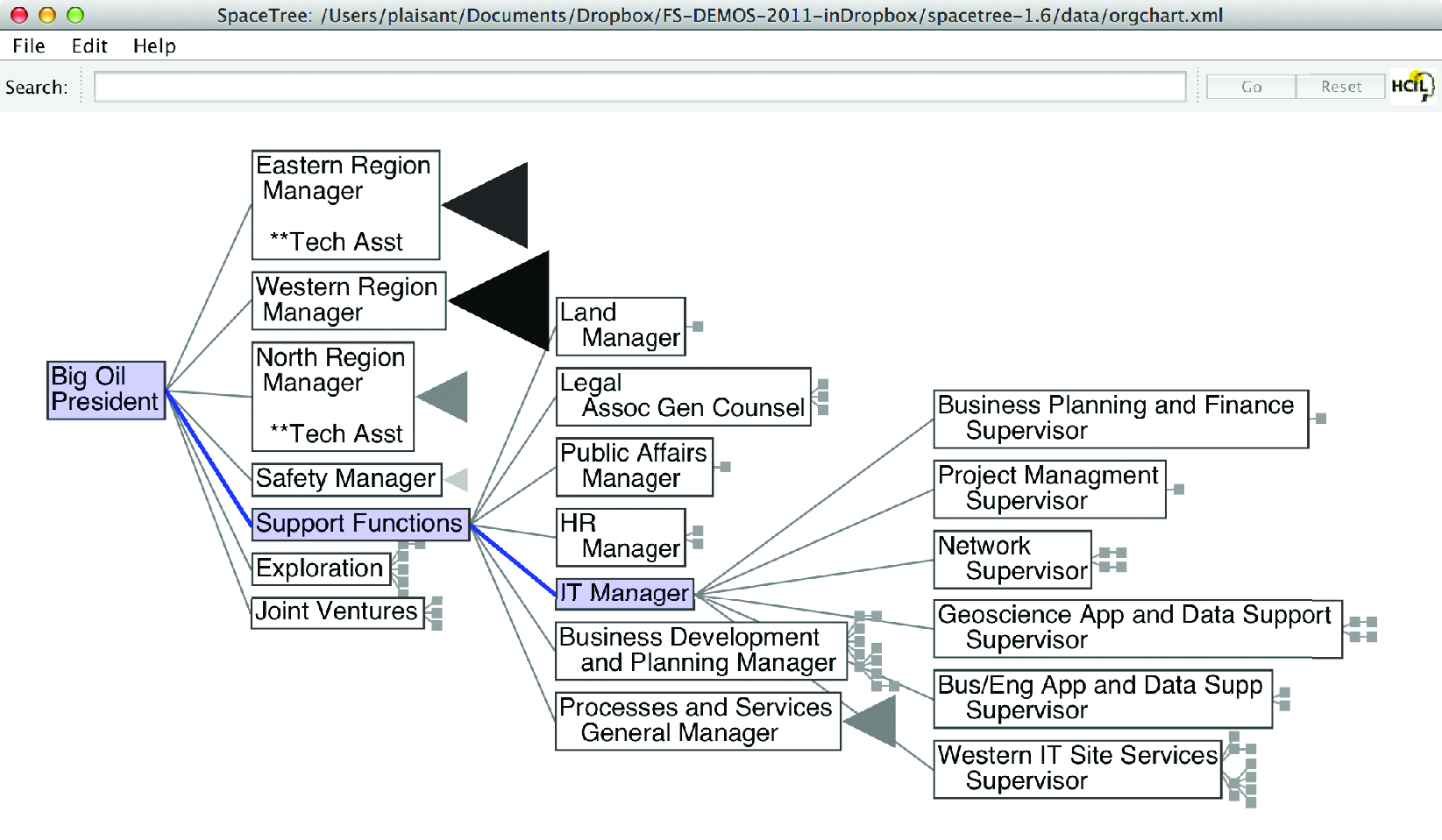
Figure 6.9: SpaceTree (http://www.cs.umd.edu/hcil/spacetree/)
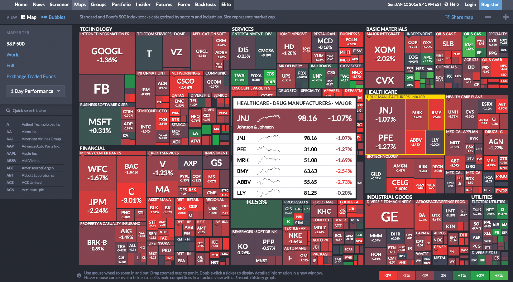
Figure 6.10: The Finviz treemap helps users monitor the stock market (https://www.finviz.com/)
6.3.5 Network data
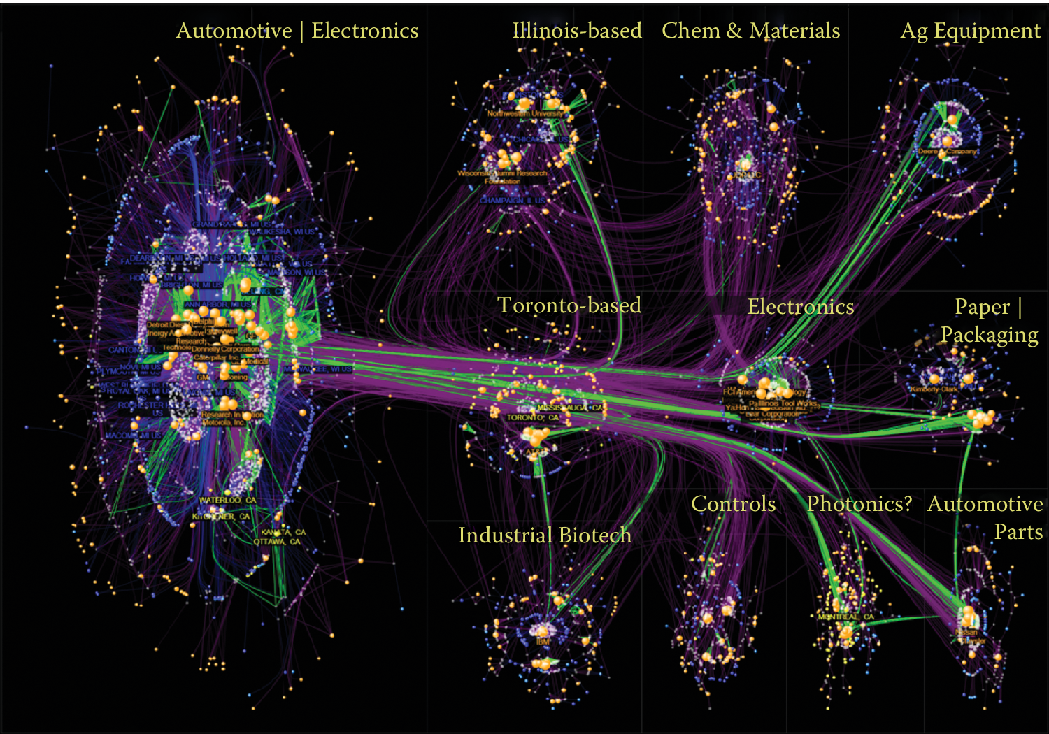
Figure 6.11: NodeXL showing innovation networks of the Great Lakes manufacturing region. Created with NodeXL. Data source: USPTO. Image created by C. Scott Dempwolf, used with permission
Network data encode relationships between items46: for example, social connection patterns (friendships, follows and reposts, etc.), travel patterns (such as trips between metro stations), and communication patterns (such as emails). The network overviews attempt to reveal the structure of the network, show clusters of related items (e.g., groups of tightly connected people), and allow the path between items to be traced. Analysis can also focus on attributes of the items and the links in between, such as age of people in communication or the average duration of communications.
![An example from "Maps of Science: Forecasting Large Trends in Science," 2007, The Regents of the University of California, all rights reserved [@borner2010atlas]](ChapterViz/figures/fig9-10b.png)
Figure 6.12: An example from “Maps of Science: Forecasting Large Trends in Science,” 2007, The Regents of the University of California, all rights reserved (Börner 2010)
Node-link diagrams are the most common representation of network structures and overviews (Figures 6.11 and 6.12, and may use linear (arc), circular, or force- directed layouts for positioning the nodes (items). Matrices or grid layouts are also a valuable way to represent networks (Henry and Fekete 2006). Hybrid solutions have been proposed, with powerful ordering algorithms to reveal clusters (Hansen, Shneiderman, and Smith 2010). A major challenge in network data exploration is in dealing with larger networks where nodes and edges inevitably overlap by virtue of the underlying network structure, and where aggregation and filtering may be needed before effective overviews can be presented to users.
Figure 6.11 shows the networks of inventors (white) and companies (orange) and their patenting connections (purple lines) in the network visualization NodeXL. Each company and inventor is also connected to a location node (blue = USA; yellow = Canada). Green lines are weak ties based on patenting in the same class and subclass, and they represent potential economic development leads. The largest of the technology clusters are shown using the group-in-a-box layout option, which makes the clusters more visible. Note the increasing level of structure moving from the cluster in the lower right to the main cluster in the upper left. NodeXL is designed for interactive network exploration; many controls (not shown in the figure) allow users to zoom on areas of interest or change options. Figure 6.12 shows an example of network visualization on science as a topic used for data presentation in a book and a traveling exhibit. Designed for print media, it includes a clear title and annotations and shows a series of topic clusters at the bottom with a summary of the insights gathered by analysts.
6.3.6 Text data
Text is usually preprocessed (for word/paragraph counts, sentiment analysis, categorization, etc.) to generate metadata about text segments, which are then visualized47. Simple visualizations like tag clouds display statistics about word usage in a text collection, or can be used to compare two collections or text segments. While visually appealing, they can easily be misinterpreted and are often replaced by word indexes sorted by some count of interest. Specialized visual text analysis tools combine multiple visualizations of data extracted from the text collections, such as matrices to see relations, network diagrams, or parallel coordinates to see entity relationships (e.g., between what, who, where, and when). Timelines can be mapped to the linear dimension of text. Figure 6.13 shows an example using Jigsaw (Stasko, Görg, and Liu 2008) for the exploration of car reviews. Entities have been extracted automatically (in this case make, model, features, etc.), and a cluster analysis has been performed, visualized in the bottom right. A separate view (rightmost) allows analysts to review links between entities. Another view allows traversing word sequences as a tree. Reading original documents is critical, so all the visualization elements are linked to the corresponding text.
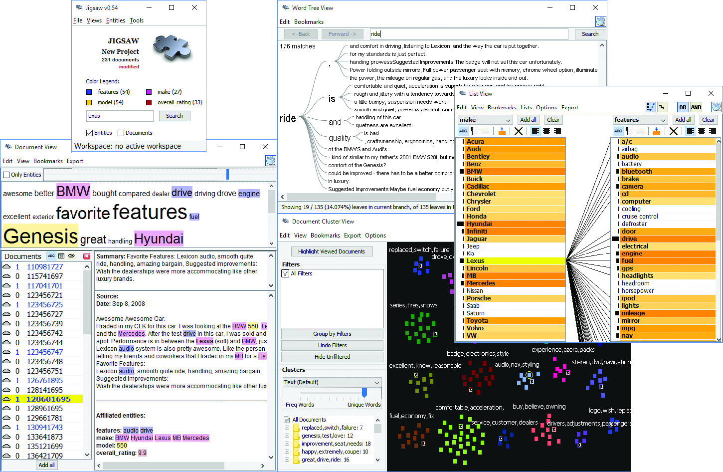
Figure 6.13: Jigsaw used to explore a collection of car reviews
6.4 Challenges
While information visualization is a powerful tool, there are many obstacles to its effective use. We note here four areas of particular concern: scalability, evaluation, visual impairment, and visual literacy.
6.4.1 Scalability
Most visualizations handle relatively small data sets (between a thousand and a hundred thousand, sometimes up to millions, depending on the technique) but scaling visualizations from millions to billions of records does require careful coordination of analytic algorithms to filter data or perform rapid aggregation, effective visual summary designs, and rapid refreshing of displays (Shneiderman 2008). The visual information seeking mantra, “Overview first, zoom and filter, then details on demand,” remains useful with data at scale. To accommodate a billion records, aggregate markers (which may represent thousands of records) and density plots are useful (Dunne and Shneiderman 2013). In some cases the large volume of data can be aggregated meaningfully into a small number of pixels. One example is Google Maps and its visualization of road conditions. A quick glance at the map allows drivers to use a highly aggregated summary of the speed of a large number of vehicles and only a few red pixels are enough to decide when to get on the road.
While millions of graphic elements may be represented on large screens (Fekete and Plaisant 2002), perception issues need to be taken into consideration (Yost, Haciahmetoglu, and North 2007). Extraction and filtering may be necessary before even attempting to visualize individual records (Wongsuphasawat and Lin 2014). Preserving interactive rates in querying big data sources is a challenge, with a variety of methods proposed, such as approximations (Fisher et al. 2012) and compact caching of aggregated query results (Lins, Klosowski, and Scheidegger 2013). Progressive loading and processing will help users review the results as they appear and steer the lengthy data processing (Glueck, Khan, and Wigdor 2014; Fekete 2015). Systems are starting to emerge, and strategies to cope with volume and variety of patterns are being described (Shneiderman and Plaisant 2015).
6.4.2 Evaluation
Human-centric evaluation of visualization techniques can generate qualitative and quantitative assessments of their potential quality, with early studies focusing on the effectiveness of basic visual variables (MacKinlay 1986). To this day, user studies remain the workhorse of evaluation. In laboratory settings, experiments can demonstrate faster task completion, reduced error rates, or increased user satisfaction. These studies are helpful for comparing visual and interaction designs. For example, studies are reporting on the effects of latency on interaction and understanding (Liu and Heer 2014), and often reveal that different visualizations perform better for different tasks (Saket et al. 2014; Plaisant, Grosjean, and Bederson 2002). Evaluations may also aim to measure and study the amount and value of the insights revealed by the use of exploratory visualization tools (Saraiya, North, and Duca 2005). Diagnostic usability evaluation remains a cornerstone of user-centered design. Usability studies can be conducted at various stages of the development process to verify that users are able to complete benchmark tasks with adequate speed and accuracy. Comparisons with the technology previously used by target users may also be possible to verify improvements. Metrics need to address the learnability and utility of the system, in addition to performance and user satisfaction (Lam et al. 2012). Usage data logging, user interviews, and surveys can also help identification of potential improvements in visualization and interaction design.
6.4.3 Visual impairment
Color impairment is a common condition that needs to be taken into consideration (Olson and Brewer 1997). For example, red and green are appealing for their intuitive mapping to positive or negative outcomes (also depending on cultural associations); however, users with red–green color blindness, one of the most common forms, would not be able to differentiate such scales clearly. To assess and assist visual design under different color deficiencies, color simulation tools can be used (see additional resources). The impact of color impairment can be mitigated by careful selection of limited color schemes, using double encoding when appropriate (i.e., using symbols that vary by both shape and color), and allowing users to change or customize color palettes. To accommodate users with low vision, adjustable size and zoom settings can be useful. Users with severe visual impairments may require alternative accessibility-first interface and interaction designs.
6.4.4 Visual literacy
While the number of people using visualization continues to grow, not everyone is able to accurately interpret graphs and charts. When designing a visualization for a population of users who are expected to make sense of the data without training, it is important to adequately estimate the level of visual literacy of those users. Even simple scatterplots can be overwhelming for some users. Recent work has proposed new methods for assessing visual literacy (Boy et al. 2014), but user testing with representative users in the early stages of design and development will remain necessary to verify that adequate designs are being used. Training is likely to be needed to help analysts get started when using visual analytics tools. Recorded video demonstrations and online support for question answering are helpful to bring users from novice to expert levels.
6.5 Summary
The use of information visualization is spreading widely, with a growing number of commercial products and additions to statistical packages now available. Careful user testing should be conducted to verify that visual data presentations go beyond the desire for eye-candy in visualization, and to implement designs that have demonstrated benefits for realistic tasks. Visualization is becoming increasingly used by the general public and attention should be given to the goal of universal usability so the widest range of users can access and benefit from new approaches to data presentation and interactive analysis.
6.6 Resources
We have referred to various textbooks throughout this chapter. Tufte’s books remain the classics, as inspiring to read as they are instructive (Tufte 2001; Tufte 2006). We also recommend Few’s books on information visualization (Few 2009) and information dashboard design (Few 2013). See also the book’s website for further readings.
Given the wide variety of goals, tasks, and use cases of visualization, many different data visualization tools have been developed that address different needs and appeal to different skill levels. In this chapter we can only point to a few examples to get started. To generate a wide range of visualizations and dashboards, and to quickly share them online, Tableau and Tableau Public provide a flexible visualization design platform. If a custom design is required and programmers are available, d3 is the de facto low-level library of choice for many web-based visualizations, with its native integration to web standards and flexible ways to convert and manipulate data into visual objects as a JavaScript library. There exist other JavaScript web libraries that offer chart templates (such as Highcharts), or web services that can be used to create a range of charts from given (small) data sets, such as Raw or DataWrapper. To clean, transform, merge, and restructure data sources so that they can be visualized appropriately, tools like Trifacta and Alteryx can be used to create pipelines for data wrangling. For statistical analysis and batch-processing data, programming environments such as R or libraries for languages such as Python (for example, the Python Plotly library) can be used.
An extended list of visualization tools and books are available at https://gallery.keshif.me/VisTools and https://gallery.keshif.me/VisBooks.
The Dataset Exploration and Visualization workbook of Chapter Workbooks uses matplotlib and seaborn for creating basic visualizations with Python.48
References
Ahlberg, Christopher, Christopher Williamson, and Ben Shneiderman. 1992. “Dynamic Queries for Information Exploration: An Implementation and Evaluation.” In Proceedings of the Sigchi Conference on Human Factors in Computing Systems, 619–26. ACM.
Anscombe, Francis J. 1973. “Graphs in Statistical Analysis.” American Statistician 27 (1): 17–21.
Boy, Jeremy, Ronald Rensink, Enrico Bertini, Jean-Daniel Fekete, and others. 2014. “A Principled Way of Assessing Visualization Literacy.” IEEE Transactions on Visualization and Computer Graphics 20 (12): 1963–72.
Börner, Katy. 2010. Atlas of Science: Visualizing What We Know. MIT Press.
Card, Stuart K., and David Nation. 2002. “Degree-of-Interest Trees: A Component of an Attention-Reactive User Interface.” In Proceedings of the Working Conference on Advanced Visual Interfaces, 231–45. ACM.
Centers for Disease Control and Prevention. 2014. “United States Cancer Statistic: An Interactive Cancer Atlas.” http://nccd.cdc.gov/DCPC_INCA. Accessed February 1, 2016.
Cleveland, William S., and Robert McGill. 1984. “Graphical Perception: Theory, Experimentation, and Application to the Development of Graphical Methods.” Journal of the American Statistical Association 79 (387). Taylor & Francis: 531–54.
DeBelius, Danny. 2015. “Let’s Tesselate: Hexagons for Tile Grid Maps.” NPR Visuals Team Blog, http://blog.apps.npr.org/2015/05/11/hex-tile-maps.html.
Dunne, Cody, and Ben Shneiderman. 2013. “Motif Simplification: Improving Network Visualization Readability with Fan, Connector, and Clique Glyphs.” In Proceedings of the Sigchi Conference on Human Factors in Computing Systems, 3247–56. ACM.
Fekete, Jean-Daniel. 2015. “ProgressiVis: A Toolkit for Steerable Progressive Analytics and Visualization.” Paper presented at 1st Workshop on Data Systems for Interactive Analysis, Chicago, IL, October 26.
Fekete, Jean-Daniel, and Catherine Plaisant. 2002. “Interactive Information Visualization of a Million Items.” In IEEE Symposium on Information Visualization, 117–24. IEEE.
Few, Stephen. 2009. Now You See It: Simple Visualization Techniques for Quantitative Analysis. Analytics Press.
Few, Stephen. 2013. Information Dashboard Design: Displaying Data for at-a-Glance Monitoring. Analytics Press.
Fisher, Danyel, Igor Popov, Steven Drucker, and Monica Schraefel. 2012. “Trust Me, I’m Partially Right: Incremental Visualization Lets Analysts Explore Large Datasets Faster.” In Proceedings of the Sigchi Conference on Human Factors in Computing Systems, 1673–82. ACM.
Glueck, Michael, Azam Khan, and Daniel J. Wigdor. 2014. “Dive in! Enabling Progressive Loading for Real-Time Navigation of Data Visualizations.” In Proceedings of the Sigchi Conference on Human Factors in Computing Systems, 561–70. ACM.
Hansen, Derek, Ben Shneiderman, and Marc A. Smith. 2010. Analyzing Social Media Networks with NodeXL: Insights from a Connected World. Morgan Kaufmann.
Harrison, Lane, Katharina Reinecke, and Remco Chang. 2015. “Infographic Aesthetics: Designing for the First Impression.” In Proceedings of the 33rd Annual Acm Conference on Human Factors in Computing Systems, 1187–90. ACM.
Henry, Nathalie, and Jean-Daniel Fekete. 2006. “MatrixExplorer: A Dual-Representation System to Explore Social Networks.” IEEE Transactions on Visualization and Computer Graphics 12 (5). IEEE: 677–84.
Inselberg, Alfred. 2009. Parallel Coordinates. Springer.
Johnson, Brian, and Ben Shneiderman. 1991. “Tree-Maps: A Space-Filling Approach to the Visualization of Hierarchical Information Structures.” In Proceedings of the Ieee Conference on Visualization, 284–91. IEEE.
Kirk, Andy. 2012. Data Visualization: A Successful Design Process. Packt Publishing.
Kraak, Menno-Jan. 2014. Mapping Time: Illustrated by Minard’s Map of Napoleon’s Russian Campaign of 1812. ESRI Press.
Lam, Heidi, Enrico Bertini, Petra Isenberg, Catherine Plaisant, and Sheelagh Carpendale. 2012. “Empirical Studies in Information Visualization: Seven Scenarios.” IEEE Transactions on Visualization and Computer Graphics 18 (9). IEEE: 1520–36.
Lins, Lauro, James T Klosowski, and Carlos Scheidegger. 2013. “Nanocubes for Real-Time Exploration of Spatiotemporal Datasets.” IEEE Transactions on Visualization and Computer Graphics 19 (12). IEEE: 2456–65.
Liu, Zhicheng, and Jeffrey Heer. 2014. “The Effects of Interactive Latency on Exploratory Visual Analysis.” IEEE Transactions on Visualization and Computer Graphics 20 (12). IEEE: 2122–31.
MacEachren, Alan M., Stephen Crawford, Mamata Akella, and Gene Lengerich. 2008. “Design and Implementation of a Model, Web-Based, GIS-Enabled Cancer Atlas.” Cartographic Journal 45 (4). Maney Publishing: 246–60.
MacKinlay, Jock. 1986. “Automating the Design of Graphical Presentations of Relational Information.” ACM Transactions on Graphics 5 (2). ACM: 110–41.
Munzner, Tamara. 2014. Visualization Analysis and Design. CRC Press.
Olson, Judy M., and Cynthia A. Brewer. 1997. “An Evaluation of Color Selections to Accommodate Map Users with Color-Vision Impairments.” Annals of the Association of American Geographers 87 (1). Taylor & Francis: 103–34.
Plaisant, Catherine, Jesse Grosjean, and Benjamin B. Bederson. 2002. “SpaceTree: Supporting Exploration in Large Node Link Tree, Design Evolution and Empirical Evaluation.” In IEEE Symposium on Information Visualization, 57–64. IEEE.
Saket, Bahador, Paolo Simonetto, Stephen Kobourov, and Katy Börner. 2014. “Node, Node-Link, and Node-Link-Group Diagrams: An Evaluation.” IEEE Transactions on Visualization and Computer Graphics 20 (12). IEEE: 2231–40.
Saraiya, Purvi, Chris North, and Karen Duca. 2005. “An Insight-Based Methodology for Evaluating Bioinformatics Visualizations.” IEEE Transactions on Visualization and Computer Graphics 11 (4). IEEE: 443–56.
Shneiderman, Ben. 2008. “Extreme Visualization: Squeezing a Billion Records into a Million Pixels.” In Proceedings of the 2008 Acm Sigmod International Conference on Management of Data, 3–12. ACM.
Shneiderman, Ben, and Catherine Plaisant. 2015. “Sharpening Analytic Focus to Cope with Big Data Volume and Variety.” Computer Graphics and Applications, IEEE 35 (3). IEEE: 10–14.
Snow, John. 1855. On the Mode of Communication of Cholera. John Churchill.
Stasko, John, Carsten Görg, and Zhicheng Liu. 2008. “Jigsaw: Supporting Investigative Analysis Through Interactive Visualization.” Information Visualization 7 (2). SAGE Publications: 118–32.
Tufte, Edward. 2001. The Visual Display of Quantitative Information, 2nd Edition. Cheshire, CT: Graphics Press.
Tufte, Edward. 2006. Beautiful Evidence, 2nd Edition. Cheshire, CT: Graphics Press.
Ward, Matthew O., Georges Grinstein, and Daniel Keim. 2010. Interactive Data Visualization: Foundations, Techniques, and Applications. CRC Press.
Wongsuphasawat, Krist, and Jimmy Lin. 2014. “Using Visualizations to Monitor Changes and Harvest Insights from a Global-Scale Logging Infrastructure at Twitter.” In Proceedings of the Ieee Conference on Visual Analytics Science and Technology, 113–22. IEEE.
Yost, Beth, Yonca Haciahmetoglu, and Chris North. 2007. “Beyond Visual Acuity: The Perceptual Scalability of Information Visualizations for Large Displays.” In Proceedings of the Sigchi Conference on Human Factors in Computing Systems, 101–10. ACM.
See Chapters Working with Web Data and APIs, Record Linkage, Databases, and Scaling up through Parallel and Distributed Computing for an overview of collecting, merging, storing, and processing data sets.↩
See Chapter Networks: The Basics.↩
See Chapter Text Analysis for text analysis approaches.↩